Google's Nano Banana is absolutely crazy!
Honestly? It's making me question everything about traditional design workflows.
Here's what I've been crushing it with:
→ Social media posts that actually stop the scroll
→ YouTube thumbnails that get clicks
→ Website graphics for landing pages
→ Email header images
Below are the exact prompt templates I use for each type of visual.
These aren't just basic prompts - they're refined through hundreds of iterations to consistently deliver stunning results.
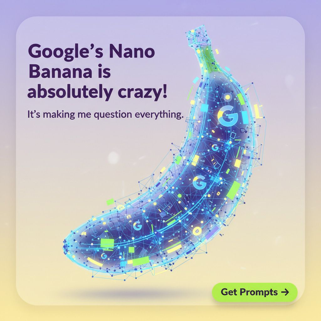
🔥 PROMPT
You are a senior marketing designer. Create a mobile-first LinkedIn post that stops scroll and communicates the core idea in 1 second GOAL - Purpose: {announce a new feature | share a case study metric | promote a webinar | launch an offer} - Single key message: "{short message in 6 to 9 words}" - Target user: B2B PARSE THE POST TEXT: [insert post here] EXTRACT: - HOOK (3–7 words) - SUBHEAD (<= 8 words) - CTA word/phrase if present Format and Canvas - Aspect ratio 1080×1350 for LinkedIn feed - Keep 120 px safe margins on all sides for text and logos - Export as PNG, crisp edges, no watermarks Brand and Style - Brand colors: {#9886fe}, {#ffde59}, {#c9ff85} - Typeface vibe: modern, bold headings, readable subheads - Visual style: clean, premium, high contrast, minimal noise - Add subtle depth with soft shadow, light gradient or glassy overlay Composition - Hero zone: top third reserved for a striking visual related to {product or idea}, not stocky - Headline: 1 line, large, left aligned, high contrast - Subhead: 1 short supporting line under headline - CTA chip in bottom right: "{CTA}" with small arrow icon Content Rules - Headline must be 6 to 9 words, no jargon, action oriented - Include one numeric proof if relevant: "{metric}" - Never clutter. Max 3 text blocks total - Ensure AA contrast for accessibility - Add alt text description under the image content: 1 sentence, 20 to 30 words RESTRICTIONS: - MUST use HOOK as the headline - MUST use SUBHEAD below it - MUST place CTA near bottom where applicable - No typos in text - No any additional text, except of headline, subline and CTA! - Perfect alignment to an 8-pt grid - No text closer than 120 px to canvas edges - Aspect ratio 1080×1350 for LinkedIn feed
2. YOUTUBE THUMBNAILS THAT GET CLICKS
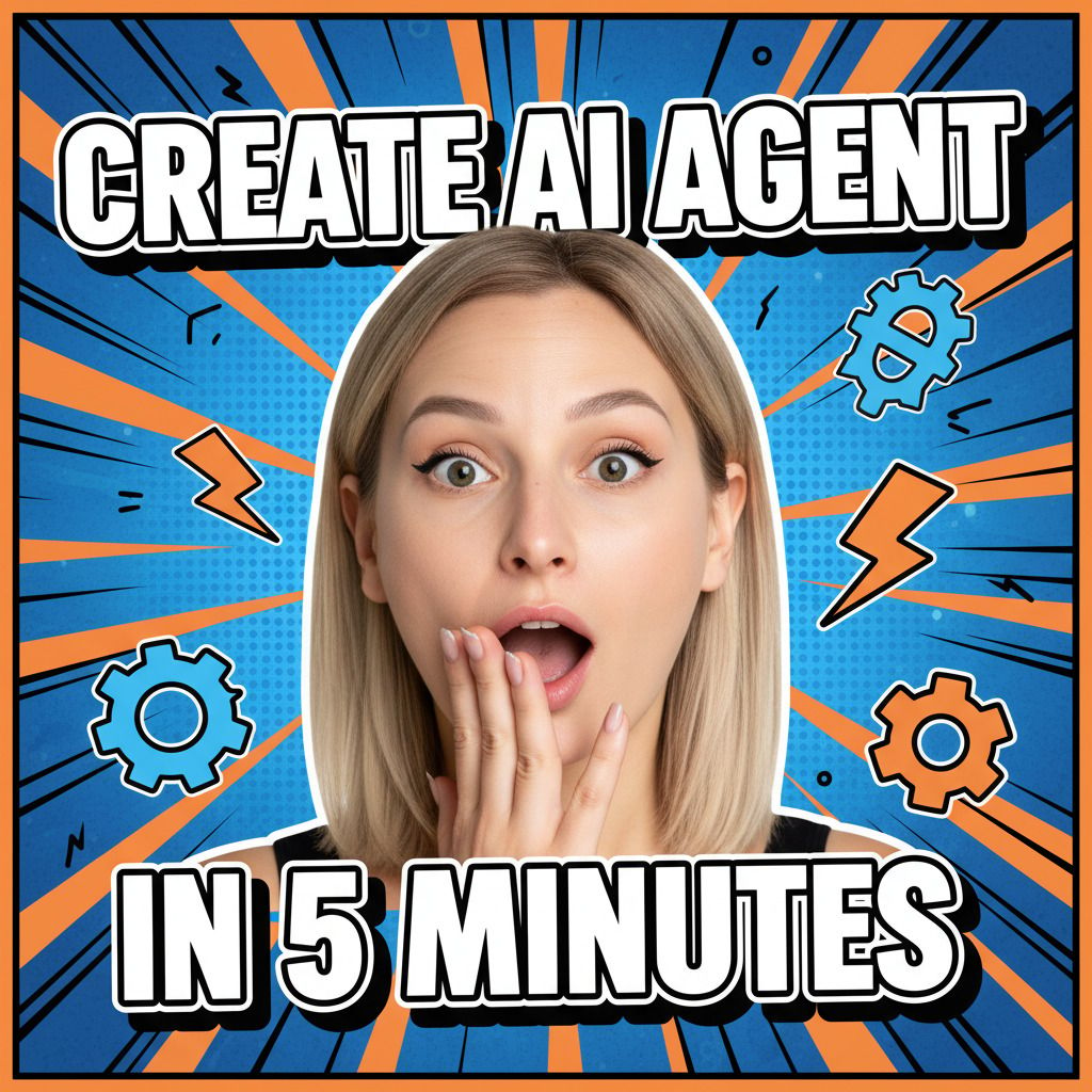
🔥PROMPT
YouTube Thumbnail Design Prompt You are a senior YouTube thumbnail designer. Your job: create a viral, click-worthy thumbnail that screams for attention and makes viewers click this over 10 competing videos. PARSE THE VIDEO TITLE: How to create AI agent in 5 minutes EXTRACT: - HOOK TEXT: [extract key hook from title] - EMOTION: awesome / shocked / blown away / mind-blown ## FORMAT: - Size: 1280×720 (YouTube standard) - 60px safe margins - Oversized bold text with white/black outline - Brutal high-contrast palette only ## DESIGN RULES: - Face = 10-15% of canvas (dominant, exaggerated emotion) - HOOK = ALL CAPS, minimum 72pt, ultra-readable at tiny size - Allowed color pairs: → Red + White (danger/urgent) → Yellow + Black (warning/power) → Blue + Orange (tech/energy) → Green + White (fresh/growth) - Max 2 main colors total - Background: aggressive but simple (gradient, glow, burst — no clutter) pop-art style - Add depth: strong shadows, glow or comic-style stroke - Make the design feel louder than competitors ## OUTPUT: 1. Thumbnail design concept 2. Alt-text (20–30 words, descriptive) 3. Use the attached photo as the main character 4. Final size 1280×720, export as crisp PNG Goal: Make it impossible to ignore in feed
3. WEBSITE GRAPHICS FOR LANDING PAGES

🔥PROMPT
Create a high-resolution, visually stunning website landing page graphic sized 1200x600 pixels, tailored for a cutting-edge B2B SaaS company. The centerpiece is a photorealistic, futuristic 3D-rendered software dashboard interface, floating slightly above a smooth white-to-light-gray gradient background with subtle texture adding elegant depth. Surround the product with semi-transparent, minimalist iconography representing core SaaS features such as an analytics graph, cloud sync, and security shield, using precise brand colors: #0047AB (deep blue), #F5A623 (vibrant orange), and #2D2D2D (charcoal gray).
On the right side, place a professional, diverse young woman in smart business casual attire, gazing thoughtfully at the dashboard, fully illuminated by warm natural light with soft shadows and subtle rim lighting to create depth and realism. Add gentle blurred abstract pastel shapes behind her to provide contrast while maintaining focus. Beneath the floating dashboard, integrate realistic reflections that anchor the product visually to the surface.
The layout and visual hierarchy are masterfully balanced for conversion:
Top-left corner reserved for a bold headline text placeholder in a clean, dark navy font, conveying clarity and professionalism.
Mid-bottom area includes a concise tagline with smaller, lighter font weight for a clear messaging flow.
The entire left side provides ample negative space reserved for visually distinctive call-to-action buttons, easily adaptable for mobile and desktop screens.
The overall style merges sleek tech futurism with warm, approachable ambiance, characterized by balanced lighting, harmonious brand color accents, and crisp, clean lines. Avoid any clutter or excessive detail to keep the focus squarely on the product and key messages. Maintain symmetrical alignment and generous spacing throughout to ensure clarity, user friendliness, and brand consistency.
4. EMAIL HEADER IMAGE

🔥 PROMPT
Create a 600x200 px high-resolution email header image for a B2B SaaS company. At the top left, feature a prominently placed, clean company logo in brand colors (#0047AB and #F5A623) for immediate recognition. Center the composition on a photorealistic 3D-rendered software dashboard floating above a subtle textured gradient background (light gray to white). Overlay near the dashboard a bold, concise offer headline in large dark navy font, e.g., 'Boost Your Team's Productivity by 30% with [Product Name]', positioned center-right for maximum visibility. Below the headline, add a smaller tagline or value proposition area in medium-weight font, such as 'Seamless collaboration tools trusted by 1000+ enterprises,' ensuring easy readability. Reserve the bottom right corner for a vibrant call-to-action button graphic in bright orange (#F5A623) labeled 'Get Started Today' with subtle hover shadow effects for visual emphasis. Add a professional, approachable human character on the right side, interacting naturally with the dashboard interface, lit softly to maintain warmth and engagement without overshadowing text elements. Maintain balanced negative space and crisp clean lines throughout, emphasizing clarity and brand alignment, with a modern tech aesthetic suitable for mobile and desktop email clients.
Pro tips for maximum results:
Specificity is King: The more detailed your prompts, the better your results
Iterate and Refine: Don't settle for the first result – generate multiple versions
Consider Context: Always specify dimensions and platform requirements
Brand Consistency: Develop your own color palette and style keywords
Speed is Everything: These prompts are designed for quick, professional results
With ❤️ to your content, Regina
